Case study 02 / 09
Monster Energy
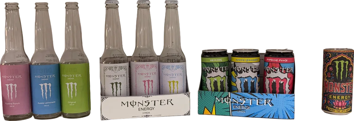
One energy drink, four visual worlds. Monster re-dressed as minimal, retro, comic-book pop art and Indian truck art.
Overview
Monster’s cans are instantly recognisable, which also means they all look the same. The brief I set myself was to keep the brand’s energy and the claw, but test how far the packaging could travel: what Monster looks like if it were designed for a design boutique, a vintage soda fountain, a comic shop or the back of a highway truck.
I designed four complete wrapper systems across three flavours each, printed them, and wrapped real cans and bottles to see them in the hand and on a shelf.
Direction 01 / 04
Retro
heritage-craft beverage
Monster reimagined as a heritage-craft beverage. Engraved, restrained and built to be kept.
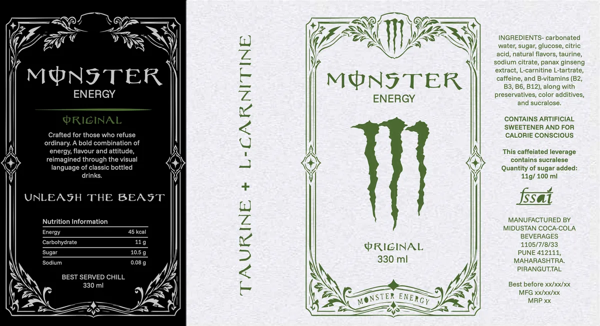
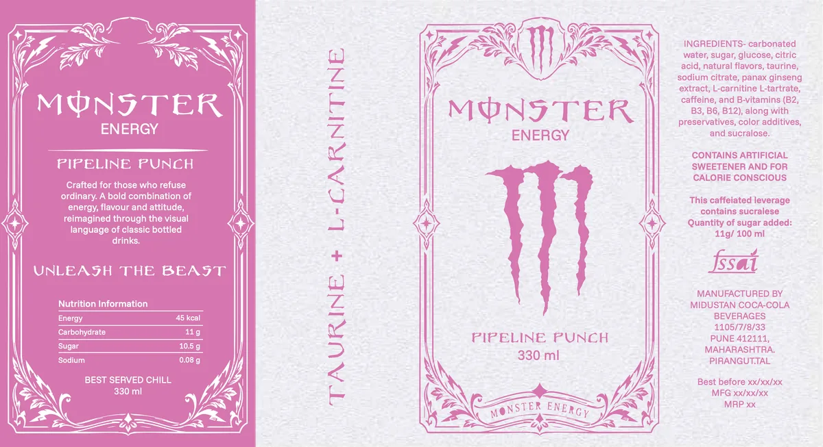
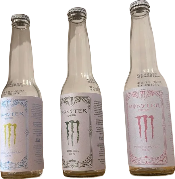
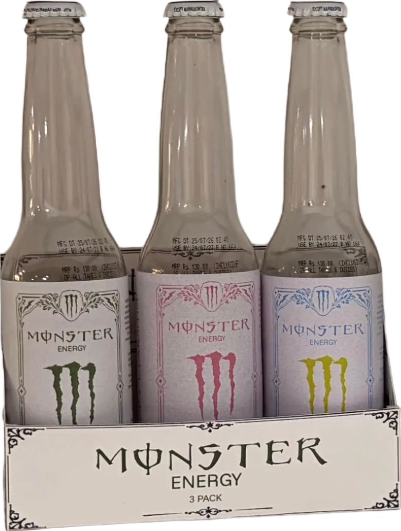
The first direction takes Monster out of the energy aisle and sets it beside craft sodas, tonics and cold brew. Etched corner ornaments and a double-rule frame hold a classic gothic wordmark, and each flavour gets a single ink on antique paper. Even the mandatory panel is treated as ornament, so the busiest side of the label becomes the most crafted one.
Glass bottle · 330 ml label · printed 3-pack carrier
The designs
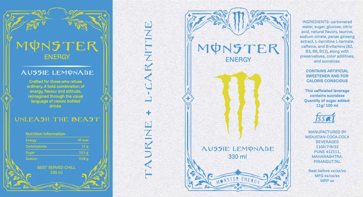
Elements, colour & type
Design elements
- Etched corner ornamentation and a double-rule frame
- Classic serif and gothic wordmark
- Single-colour, high-contrast palette per flavour
- Full regulatory and nutrition panel treated as ornament
Colour
- #0F0F0FInk Black
- #ECEEF0Antique Paper
- #4F7A3ABotanical Green
- #C979ACPipeline Pink
- #5B93CDAussie Blue
- #94A188Muted Sage
Ink on antique paper, one flavour colour per SKU. No gradients, no highlights, flat single-colour printing.
Typography
- Custom gothic wordmark paired with a high-contrast serif for flavour descriptors
- Engraved small caps run the TAURINE + L-CARNITINE spine
- Condensed grotesque at 6 pt for nutrition and regulatory copy
- Wide letterspacing throughout, so the spacing does the decorating
Mock-ups
Direction 02 / 04
Minimal
one colour, clear hierarchy
Strip everything back to the claw. One colour, clear hierarchy, nothing to explain.
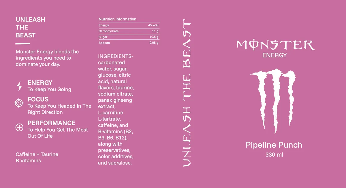
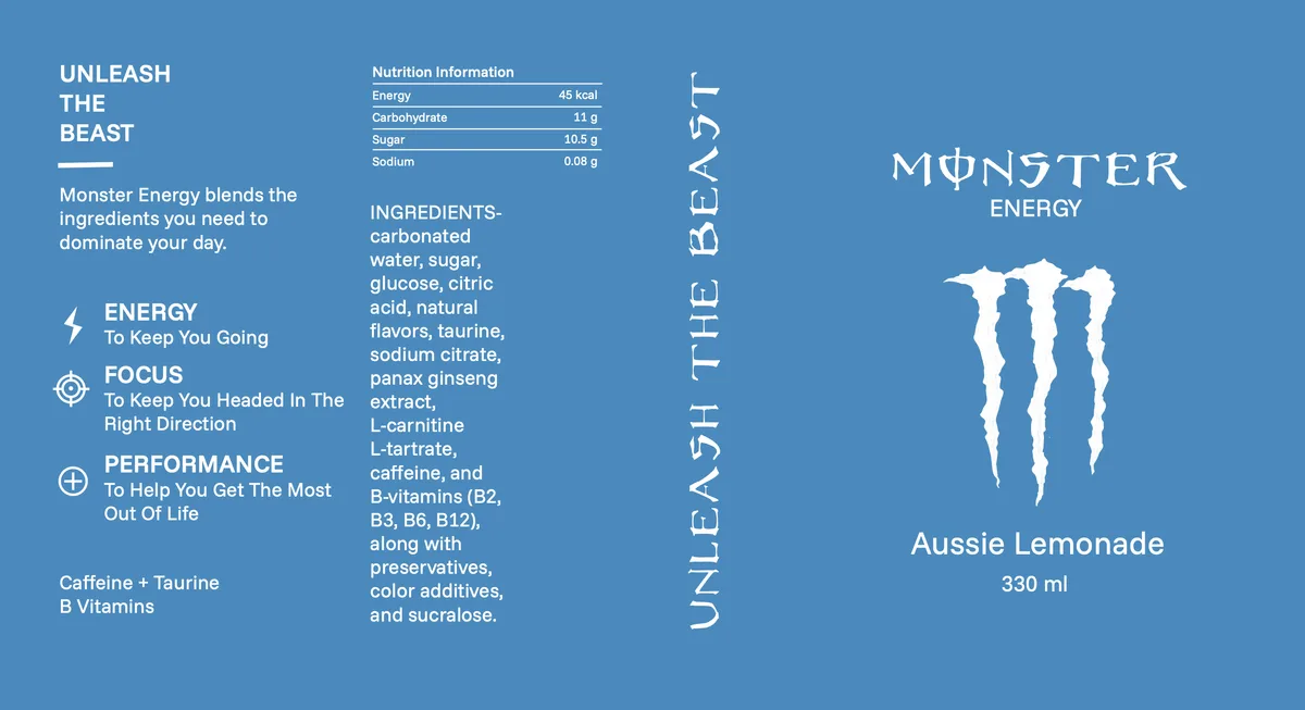
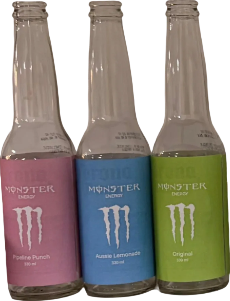
Direction two goes the other way. Each flavour is one flat field of colour with everything else reversed out in white, so the colour itself becomes the SKU and you can tell the flavours apart from three metres away. Up close, a small icon set for Energy, Focus and Performance gives you a reason to pick it up. No rules, no boxes, the hierarchy comes from size and weight alone.
Glass bottle · 330 ml label · colour-blocked 3-pack carrier
The designs
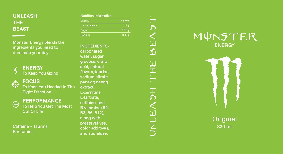
Elements, colour & type
Design elements
- One dominant flat colour per flavour
- Reversed-out claw mark as the only image
- Benefit icon set for Energy, Focus and Performance
- Clear typographic hierarchy, no rules or boxes
Colour
- #95BE55Original Green
- #BB719CPipeline Pink
- #5A88B8Aussie Blue
- #FFFFFFPure White
- #1A1A1AText Black
- #C5DBA1Tint 40%
One saturated field per flavour, everything else reversed out in white. Tints are used only for the nutrition table.
Typography
- One grotesque family, three weights, nothing else
- Hierarchy built from size and weight alone, with no rules, panels or reversed boxes
- UNLEASH THE BEAST set vertically as a full-height spine, letterspaced wide
- Flavour name and volume share a size, so colour identifies the SKU, not the type
Mock-ups
Direction 03 / 04
Pop Art
the pack as its own poster
Turn the attitude up. Halftone, burst lines and hand-lettering make the can its own poster.
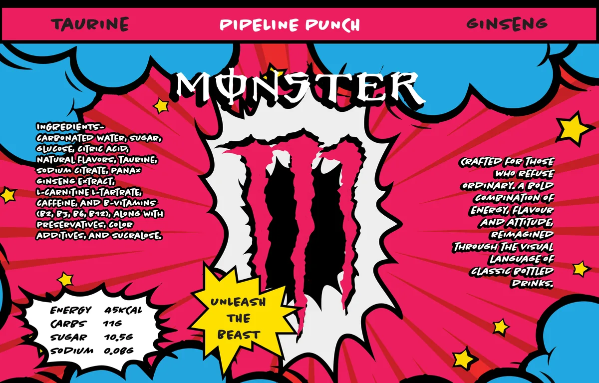
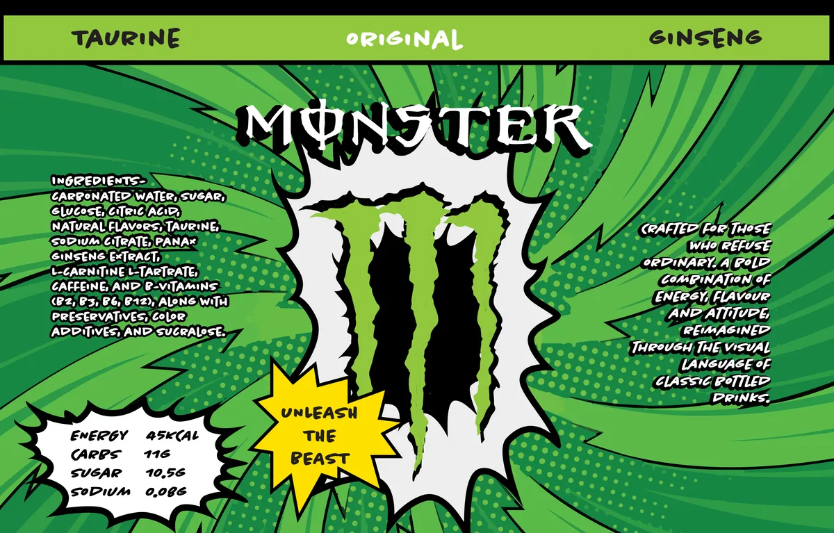
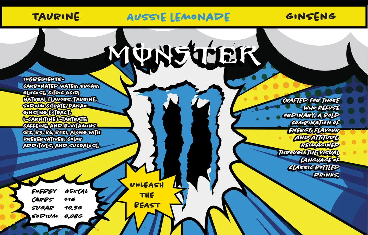
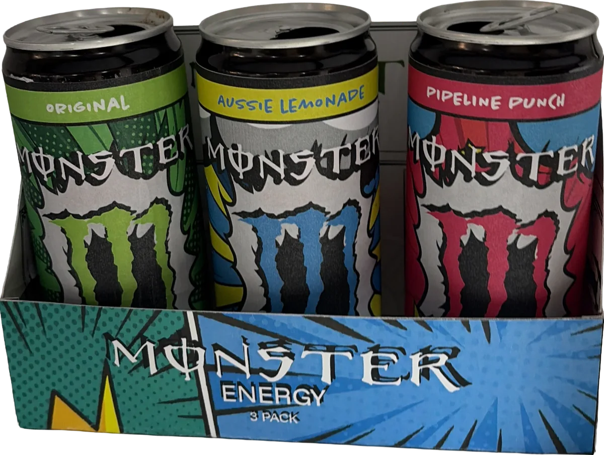
Pop Art pushes Monster's existing attitude as loud as it will go. Halftone dots, burst lines and starburst callouts fill every face, and everything is hand-lettered, even the ingredient list, so there is no quiet side on the can. The three flavours read as a set worth collecting, and the 3-pack carrier works as a display unit on its own.
330 ml can wrap · burst-line 3-pack carrier
The designs
Elements, colour & type
Design elements
- Halftone dot and burst-line texture
- Bold outlined comic lettering with a drop shadow
- High-saturation flavour colourways
- Starburst callouts carrying the key claims
Colour
- #D93960Punch Magenta
- #5EA8D7Comic Blue
- #F3E956Halftone Yellow
- #4A8750Original Green
- #0A0708Outline Black
- #F1ECD2Newsprint
Four-colour comic printing logic. Saturated primaries, a heavy black outline and warm newsprint white as the ground.
Typography
- Hand-drawn comic capitals for the wordmark, with a heavy outline and hard drop shadow
- All secondary copy hand-lettered in uneven caps, so even the ingredient list reads as artwork
- Flavour name in a solid banner across the top of the wrap
- Starburst callouts carry claims on tight, bouncing baselines
Mock-ups
Direction 04 / 04
Truck Art
a limited India edition
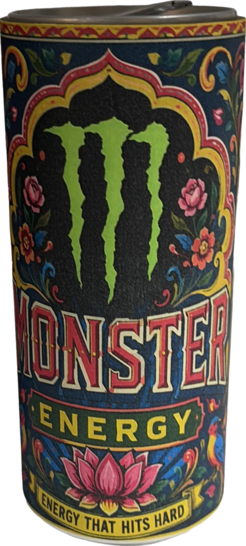
Monster painted in the language of the Indian highway. Dense, ornamental, unmistakably local.
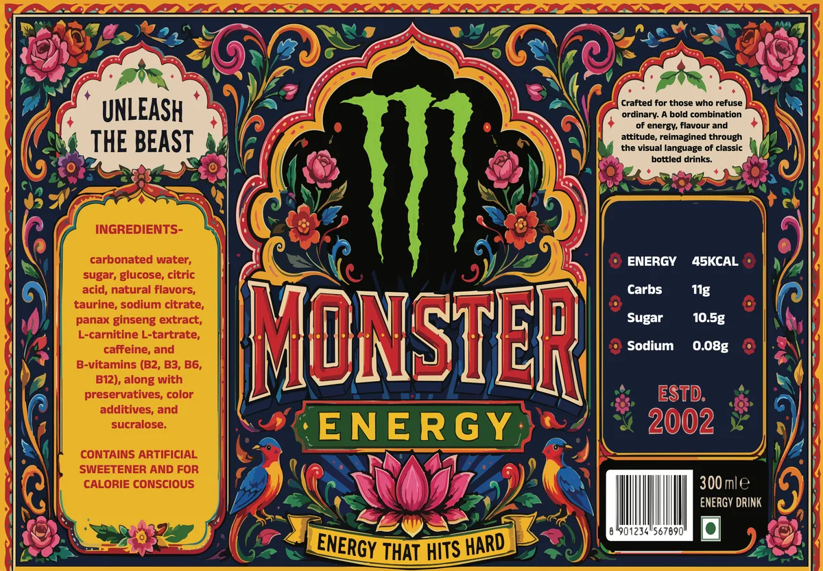
The last direction brings Monster home. Hand-painted florals, lotuses and birds cover every inch, jewel tones sit on a midnight ground and a decorative arch frames the claw. Every mandatory element gets its own painted container, an arch, a banner or an Estd. 2002 badge, so a legally dense can still reads as one hand-painted object. It's a single limited-edition SKU, and a new flavour would only need the arch repainted.
330 ml can wrap · single limited-edition SKU
The designs
Elements, colour & type
Design elements
- Hand-painted floral, lotus and bird ornamentation
- Jewel-toned, high-density colour with no empty ground
- Decorative arch framing the claw mark
- Custom Estd. 2002 badge and painted strapline banner
Colour
- #192030Midnight Navy
- #DCB752Brass Gold
- #9E3A3BVermilion Rose
- #96BF56Claw Green
- #E7D1A7Cream
- #AD5849Terracotta
Jewel tones on a midnight ground, lifted with brass gold. No unpainted areas, colour density is the point.
Typography
- Hand-painted dimensional slab capitals for MONSTER, outlined, highlighted and shadowed in three colours
- ENERGY reversed out of a gold banner beneath the wordmark
- A brush-drawn ribbon carries the strapline ENERGY THAT HITS HARD
- Estd. 2002 as a painted badge, with regulatory copy held in cartouches
Mock-ups
Four directions, one shelf