Case study 03 / 09
Mamaearth
A softer, friendlier rebrand for a toxin-free personal care brand, with a full 36-page brand guideline.
Overview
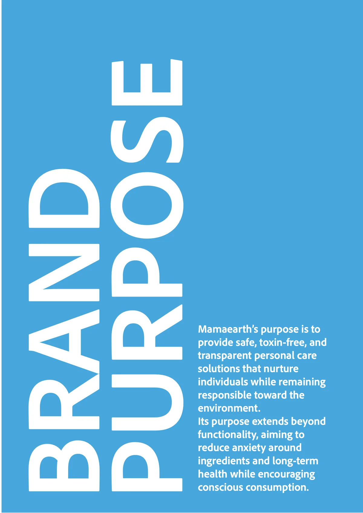
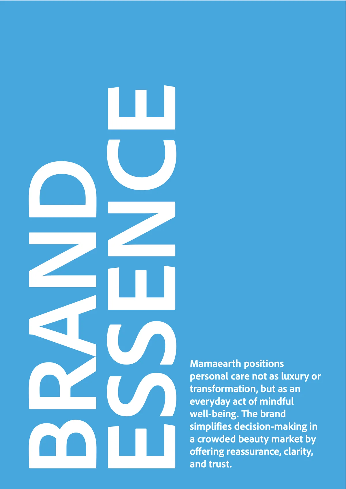
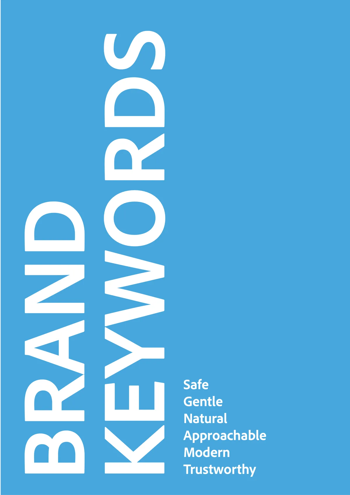
Mamaearth positions personal care as an everyday act of mindful well-being rather than luxury. The brand promise is safe, gentle, natural, approachable, modern and trustworthy, but the identity didn’t feel as soft as the products.
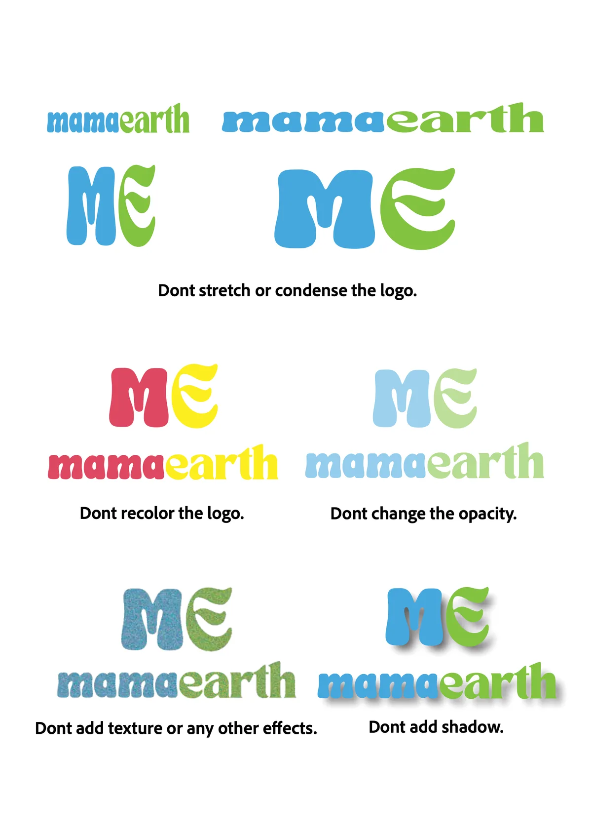
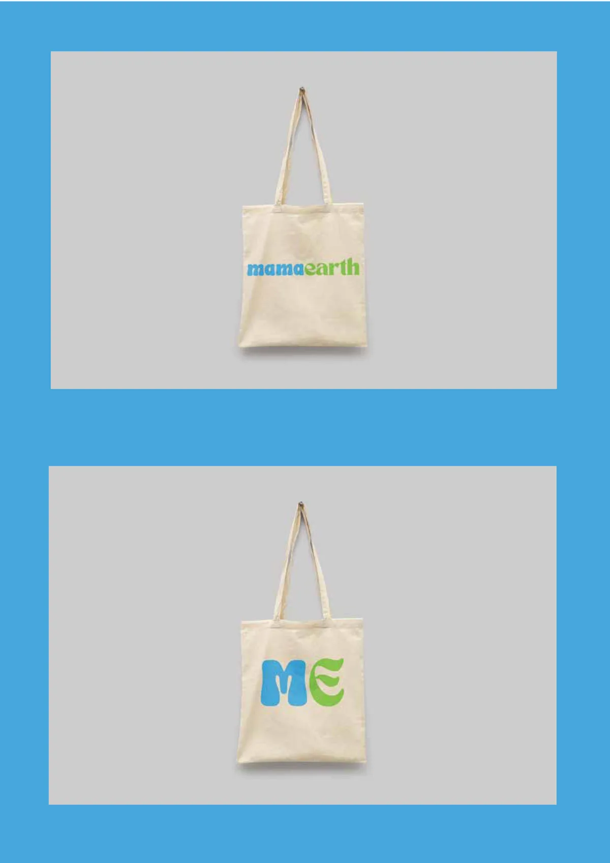
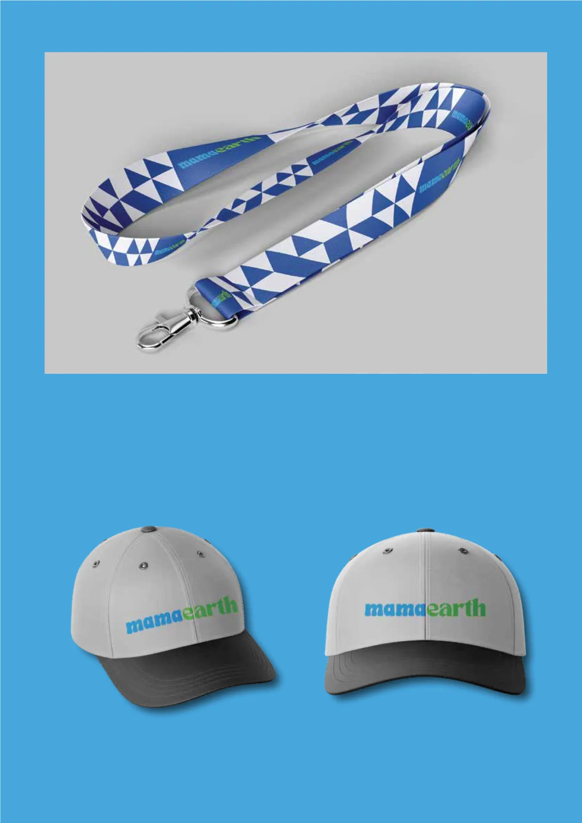
I researched the brand’s story and purpose, explored more than a dozen logo directions, and built a complete guideline: primary and secondary logos, concept, clear space, scaling, misuse, colour, typography and real-world mock-ups.
The idea
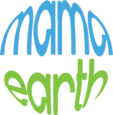
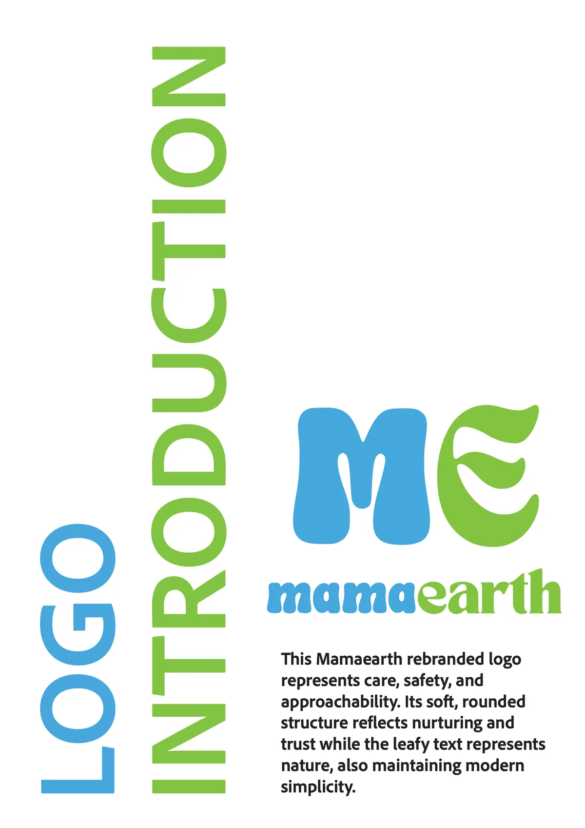
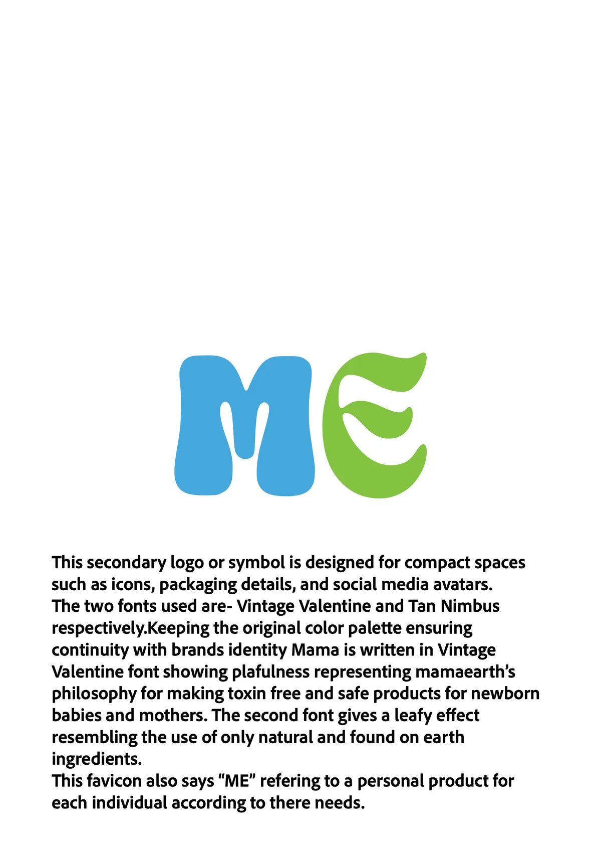
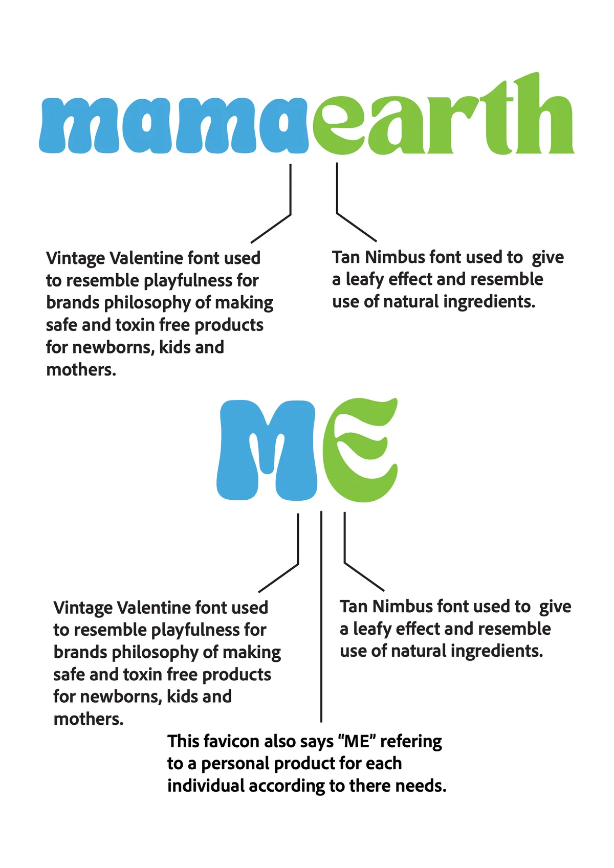
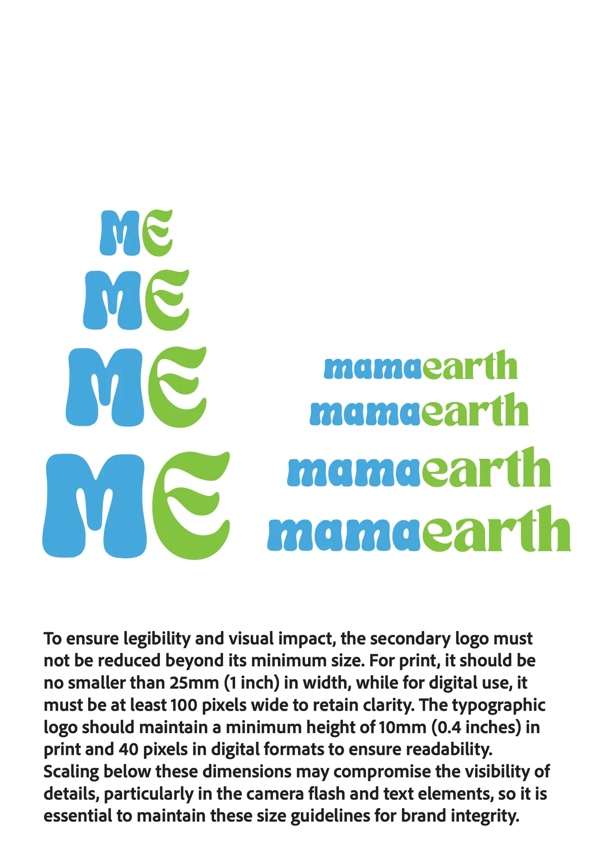
Mamaearth started with two parents looking for safe products for their newborn. The new mark leans into that. "Mama" is set in a playful, rounded script for care and warmth; "earth" uses a leafy face for natural ingredients. The compact symbol reads "ME", a personal product for every individual.
The logo
Ideation · 11 sketches
Eleven directions for the new mark, each wrapping MAMA EARTH into a rounded, globe-like form in the brand's own blue and green.
 01
 02
 03
 04
 05
 06
 07
 08
 09
 10
 11
Final logo



Logo breakdown


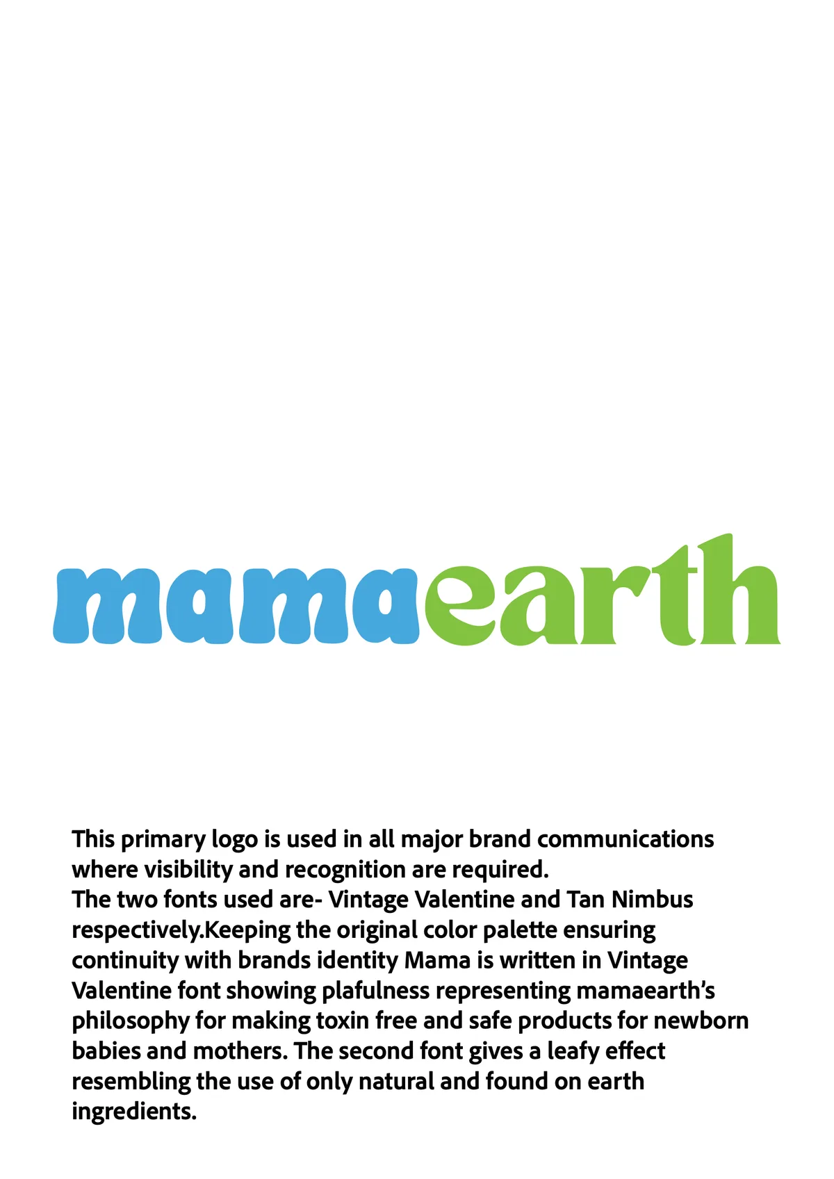
Playful, for the brand's philosophy of making safe, toxin-free products for newborns, kids and mothers.
Gives a leafy effect that stands for natural ingredients.


Playful and soft
Leafy
Together the letters read ME, a personal product for each individual, made for their own needs.
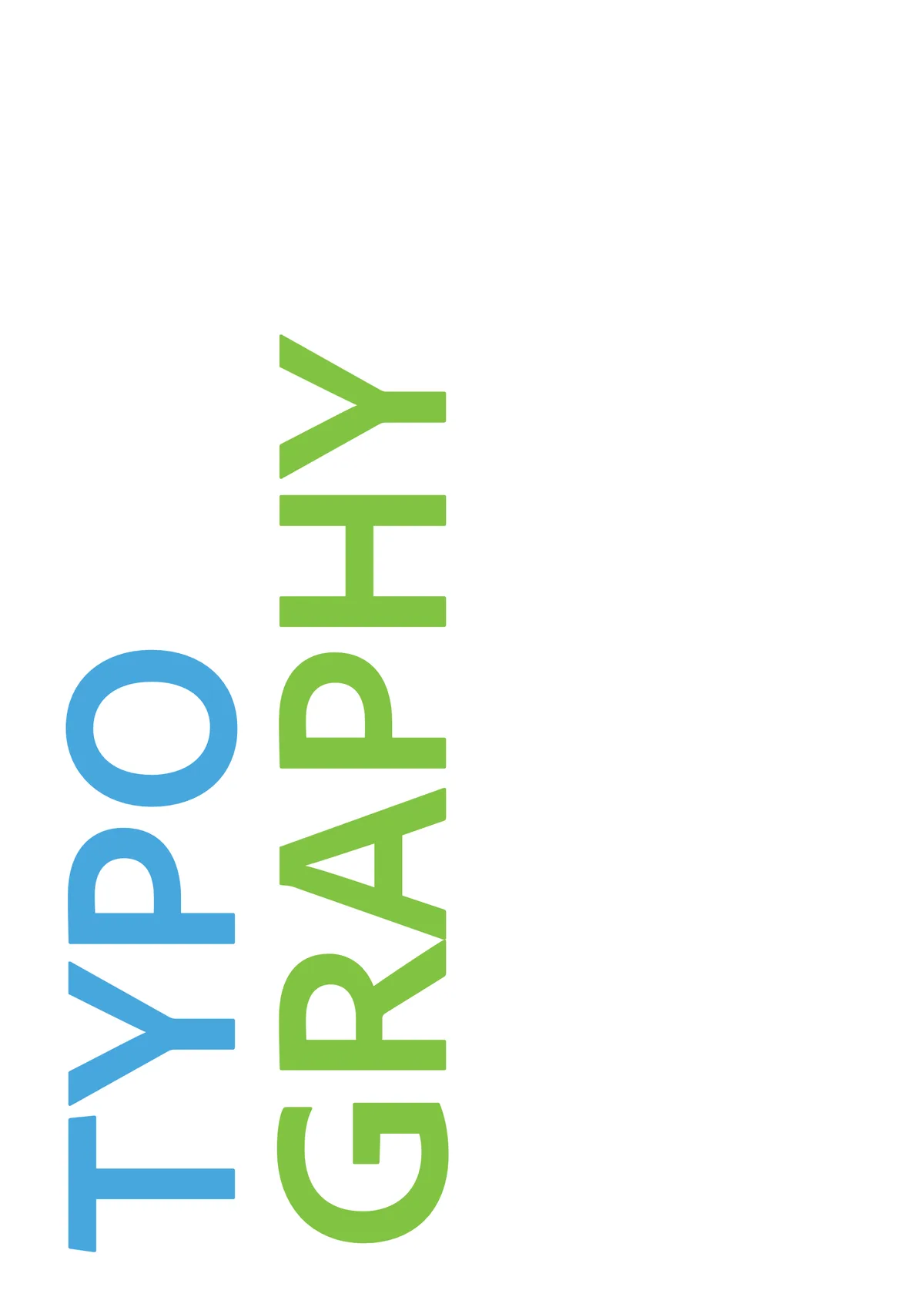
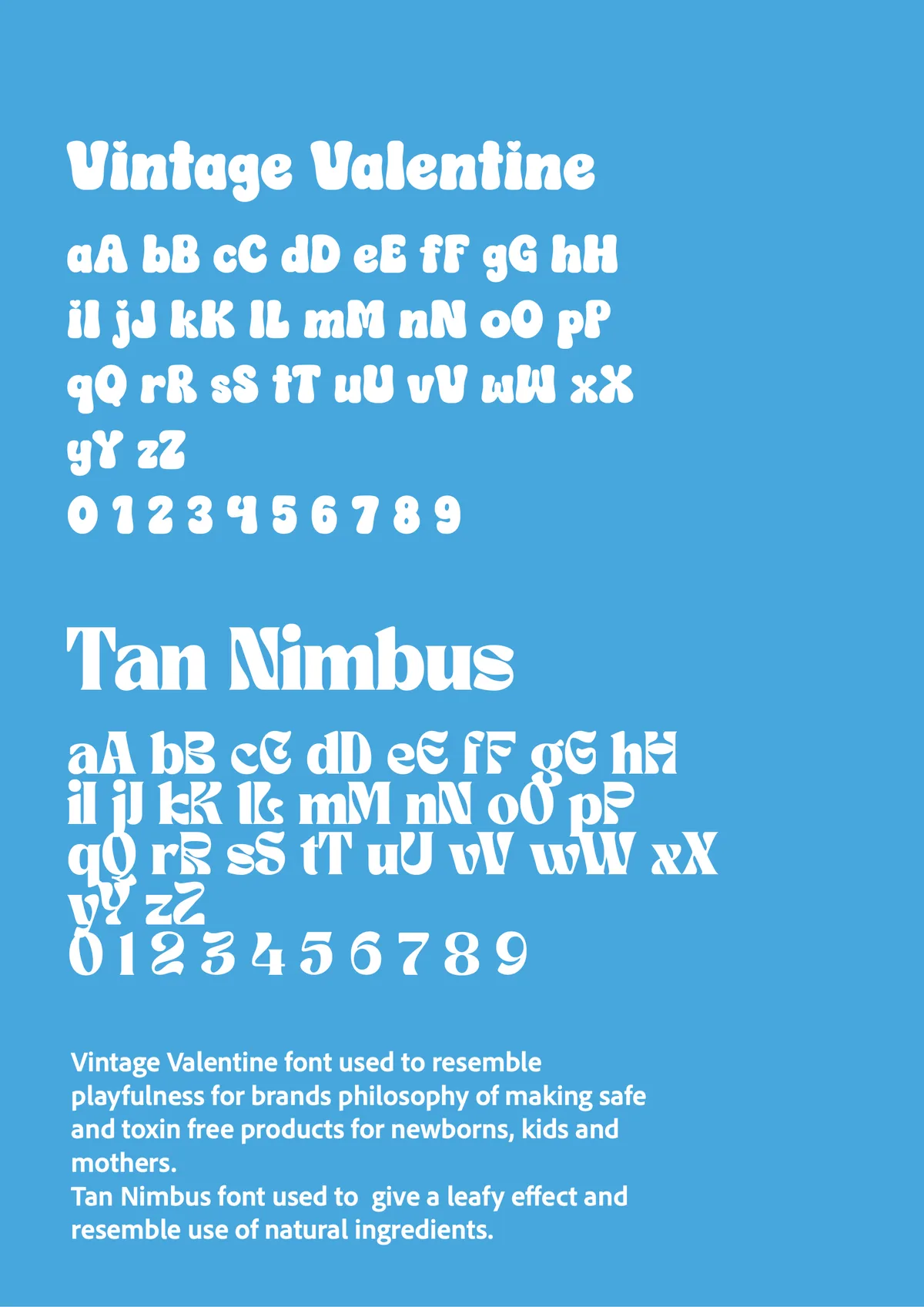
Typography

Rounded and playful, for the brand's philosophy of making safe, toxin-free products for newborns, kids and mothers.
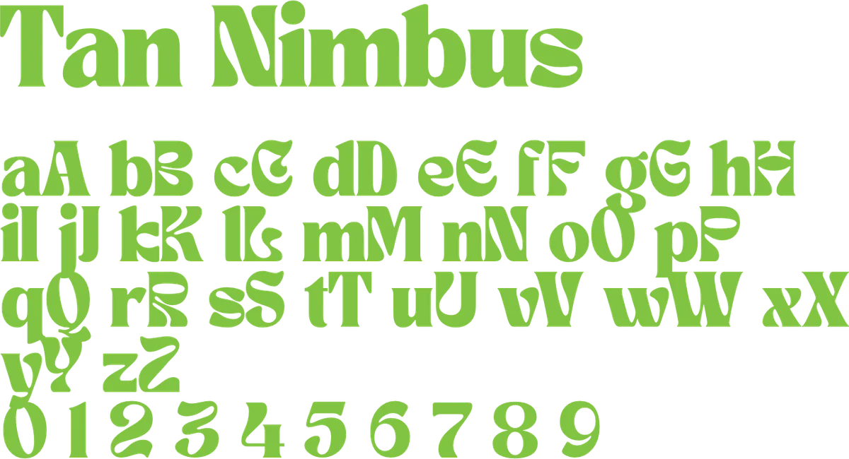
Its leafy curves stand for ingredients that are natural and found on earth.
Colour
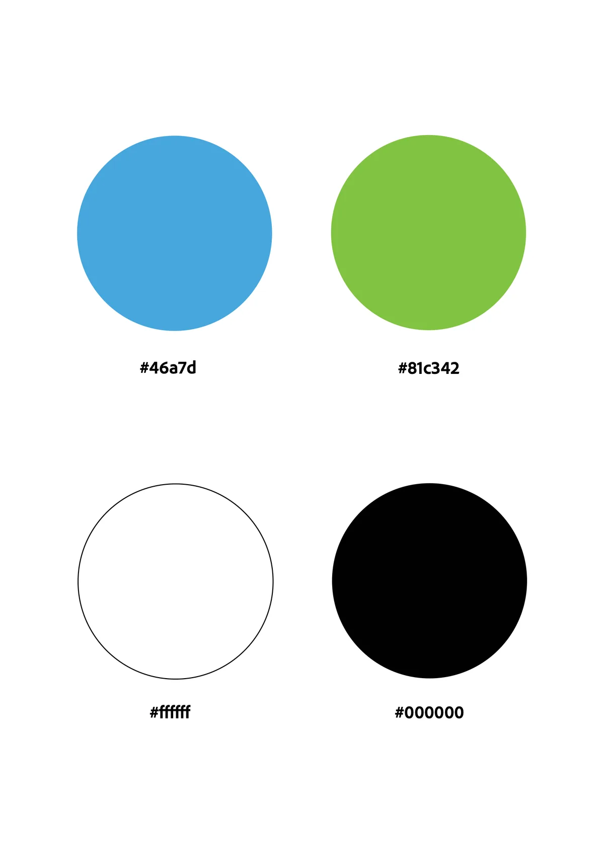
- Blue#46A7DD
- Green#81C342
- White#FFFFFF
- Black#000000
The original Mamaearth blue and green are kept for continuity with the brand, with white and black as neutrals.
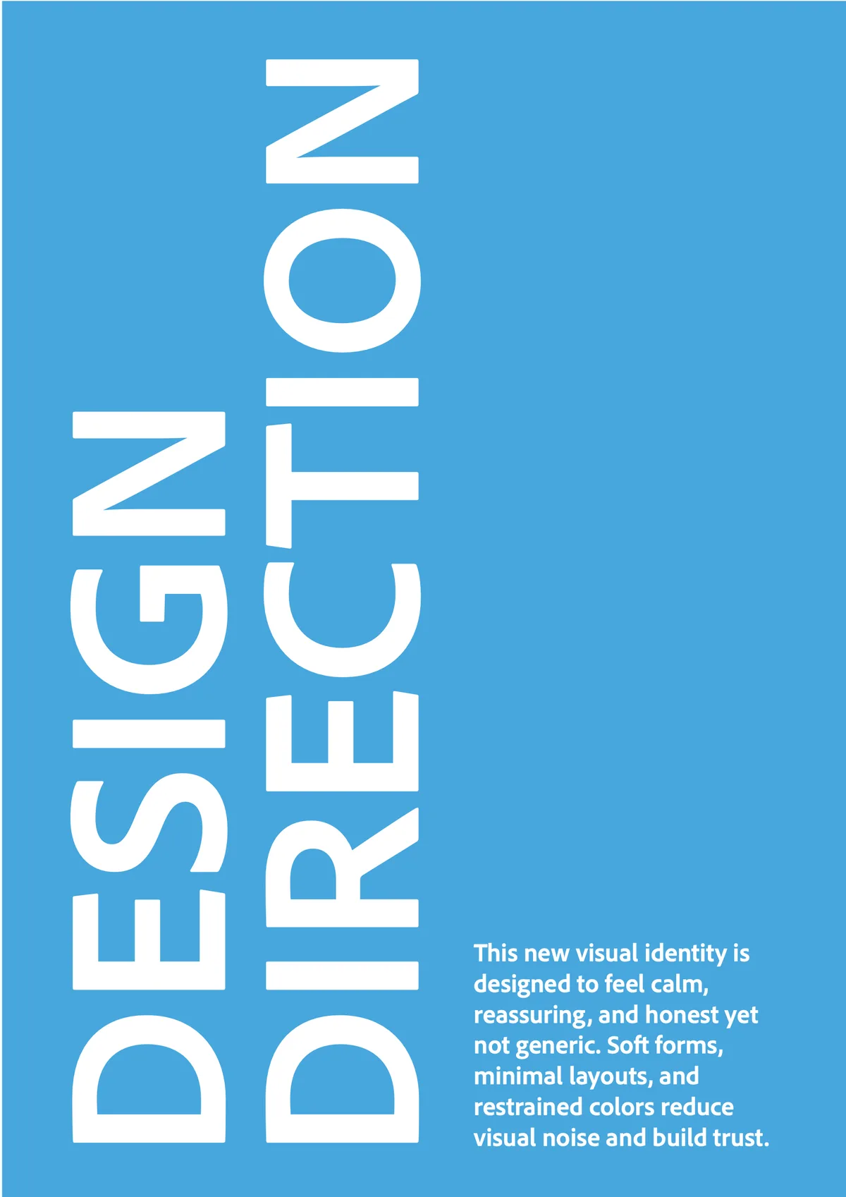
Calm, reassuring and honest, yet not generic.
Brand guidelines
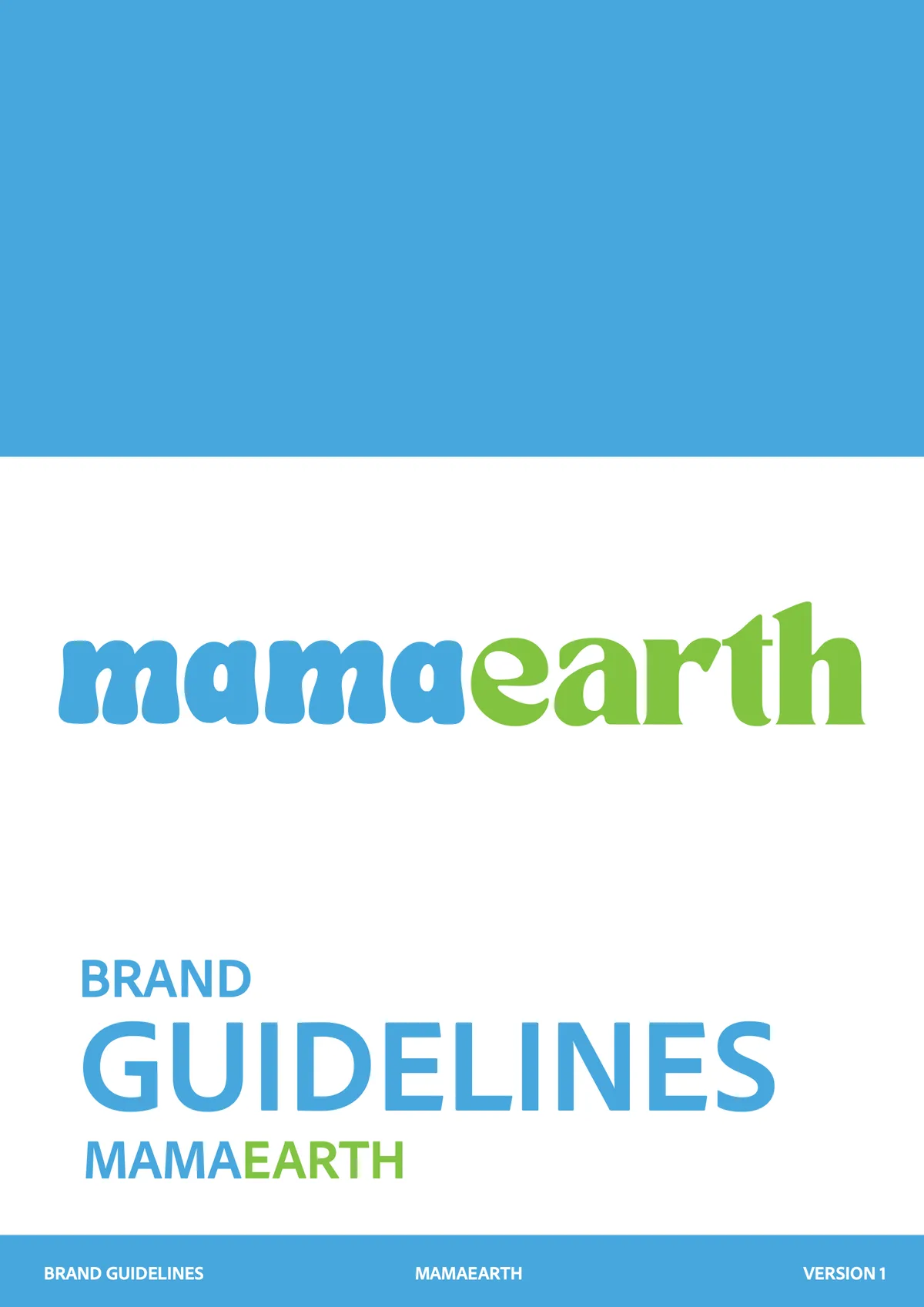
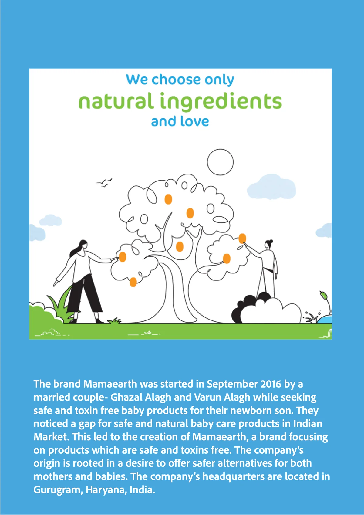
Open full screen ↗Every page · 36 pages
- 01
- 02

- 03

- 04

- 05
- 06
- 07
- 08
- 09
- 10

- 11
- 12
- 13
- 14
- 15
- 16

- 17
- 18

- 19
- 20
- 21
- 22

- 23
- 24
- 25
- 26
- 27
- 28

- 29
- 30
- 31
- 32
- 33
- 34

- 35
- 36