Case study 07 / 09
Maggi Signature
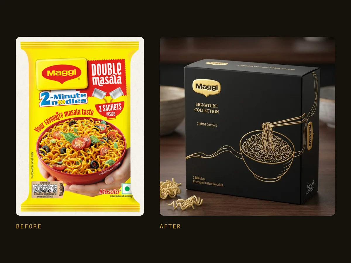
Same two-minute noodles, a completely new customer. Maggi repositioned as a black-and-gold gift for premium shoppers.
Overview
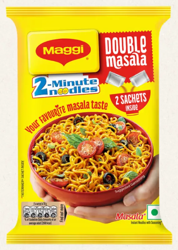
Maggi’s pack is bright yellow and red, crowded with food photography and built for instant recognition at the lowest price point. It’s friendly, everyday and familiar, which is exactly why it makes a good test.
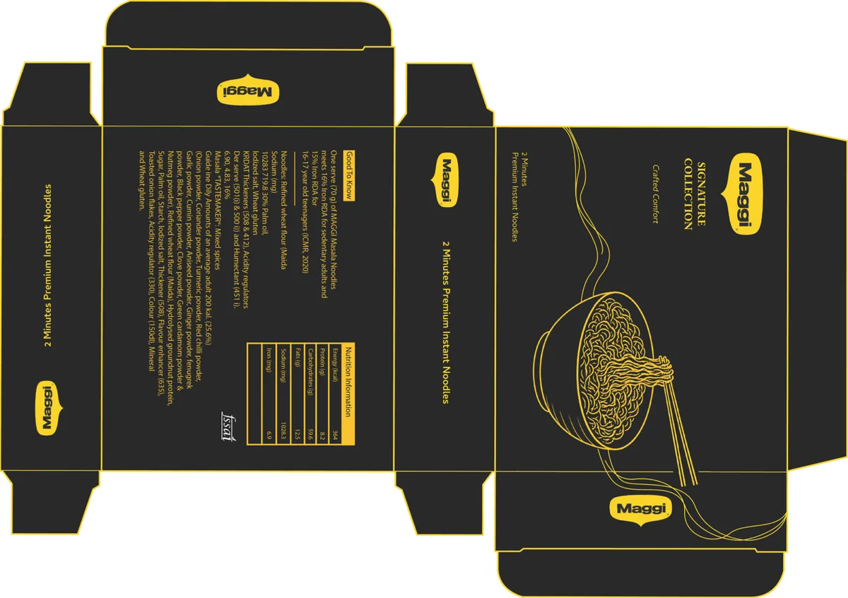
I asked what Maggi would look like if it had to sit next to premium chocolates in a gourmet store, then designed the full box: audience research, a luxury visual language and a print-ready dieline.
The brief
Understand how packaging talks to different people by redesigning an existing product for a completely new audience. The product stays exactly the same; only the packaging changes, through typography, colour, graphics and layout.
Research
First, who Maggi speaks to today, and who it would have to win over.
01
The existing pack
Maggi 2-Minute Noodles is made for families, students, children, working professionals and budget-conscious buyers, with a friendly, everyday, familiar, affordable and convenient personality. The pack is built to match.
- A bright yellow and red colour palette
- Large product photography
- Bold typography
- An information-heavy layout
- A focus on affordability, convenience and instant recognition
- Yellow
- Red
02
The new audience
Luxury and premium lifestyle consumers: urban professionals, premium grocery shoppers, food enthusiasts and gift buyers. What they look for:
- Premium quality
- Elegant design
- Minimal aesthetics
- An exclusive appearance
- Sophisticated branding
Design strategy
A luxury visual language borrowed from premium chocolates, gourmet foods and luxury lifestyle brands.
01
Colour & finish
The bright, crowded original gives way to a black and gold palette that signals exclusivity straight away. Black stands for sophistication, the gold graphics come from luxury packaging, and the box is finished in gold foil with emboss and deboss on a textured stock.
- Black
- Gold
02
Illustration & space
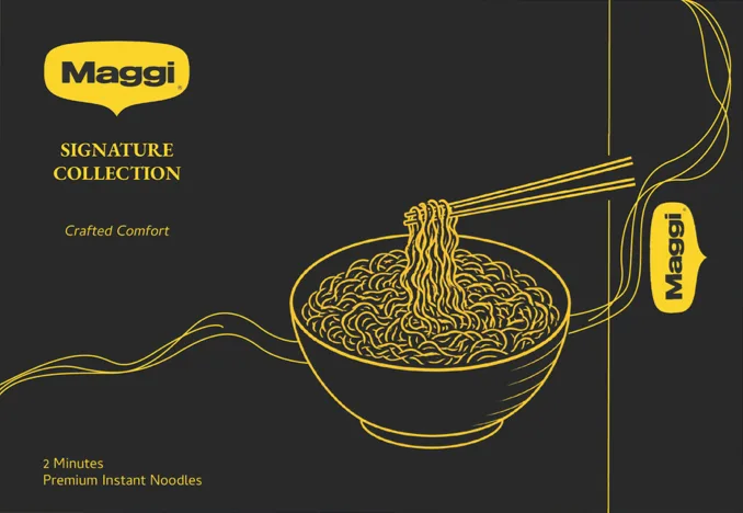
Food photography is replaced by fine line illustration, with a clean layout and generous negative space instead of clutter. It reads as crafted, and the iconic Maggi logo keeps it unmistakably Maggi.
03
Type & hierarchy
Minimal typography and a refined information hierarchy, arranged for readability, so the box feels calm, luxurious and intentional.
04
Naming
The name Signature Collection makes it a gourmet edition, at home in premium supermarkets, specialty food stores and curated gift collections.
Dieline to box
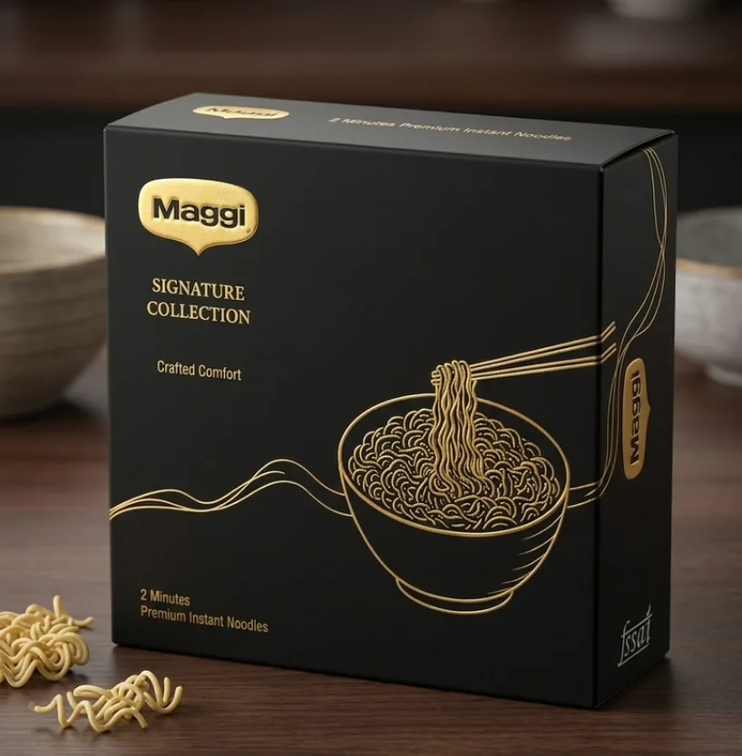
The result
The aim was to shift Maggi from an everyday instant noodle to a premium lifestyle product without touching the product itself. The redesign shows how packaging alone can change how people see a product, and reposition a mass-market pack for an entirely new audience.
From everyday noodle to a premium lifestyle product.